Valley Library
Fresh Look: Valley Library Events Redesign
November 2024
(2 weeks)
Project Detail
Valley Library Graphic Design
Role
Graphic Designer
Illustrator
Duration
Tools
Illustrator
Procreate
Brief
To redesign the event tall kiosk for The Valley Library, focusing on improving accessibility, visual appeal, and user engagement for a target audience of 18–25-year-olds.
Overview
The Valley Library regularly promotes events through static posters. However, the previous design struggled to capture attention and effectively communicate key details, especially for college students accustomed to engaging with modern, dynamic interfaces.
Solution
Created a refreshed design using a more user-friendly and visually appealing layout. The new poster combines an interactive digital interface aesthetic, brighter colors, and modern illustrations to make information more engaging and accessible.
Research
Target Audience
Individuals aged 18 – 25

Dynamic young adults seeking accessible, tech-friendly solutions to support their academic success.
Problem
Old Design


Overly Formal and Static Layout
The old design lacks visual dynamism, making it appear rigid and less engaging. Its heavy reliance on plain text blocks and minimal graphical elements does not capture attention effectively, especially for younger audiences or casual viewers.
Limited Color Palette and Clarity
The dark background with minimal color contrast can make it harder to read or distinguish events quickly. Additionally, the lack of pastel tones or modern design elements makes the material feel outdated and less inviting.
Lack of Personality and Branding
The old design does not incorporate playful or memorable visuals, such as mascots or creative imagery, which could make the library events feel more relatable and welcoming.
User needs
Event details that highlight time, location, and descriptions
Engaging design that atch audience preferences
Clear differentiation event categories
User goals
Easily access relevant details without confusion
Stay informed about library events
Feel excited about attending events
User frustrations
Difficulty finding key event information
Lack of engaging visuals to draw attention
Overwhelming or unappealing design
Provide clear and accessible event information, including time, location, and details

Need & Solution
Create a visually appealing design that captures attention and aligns with user preferences
A modern design that incorporates digital interface elements, playful yet clean visuals, and effective use of hierarchy to highlight key details
Goal

Differentiate event types for easier navigation and understanding
Introduced unique color schemes and visual markers for each event category to improve recognition and organization
Create a design that increases event awareness and participation among the target audience
Designed an intuitive layout with prominent headings, icons, and concise descriptions for quick reference
Design
Design System
Font

OSU Brand Colors
Playful
Tone of Voice
Clear & Concise

Inviting
Modern
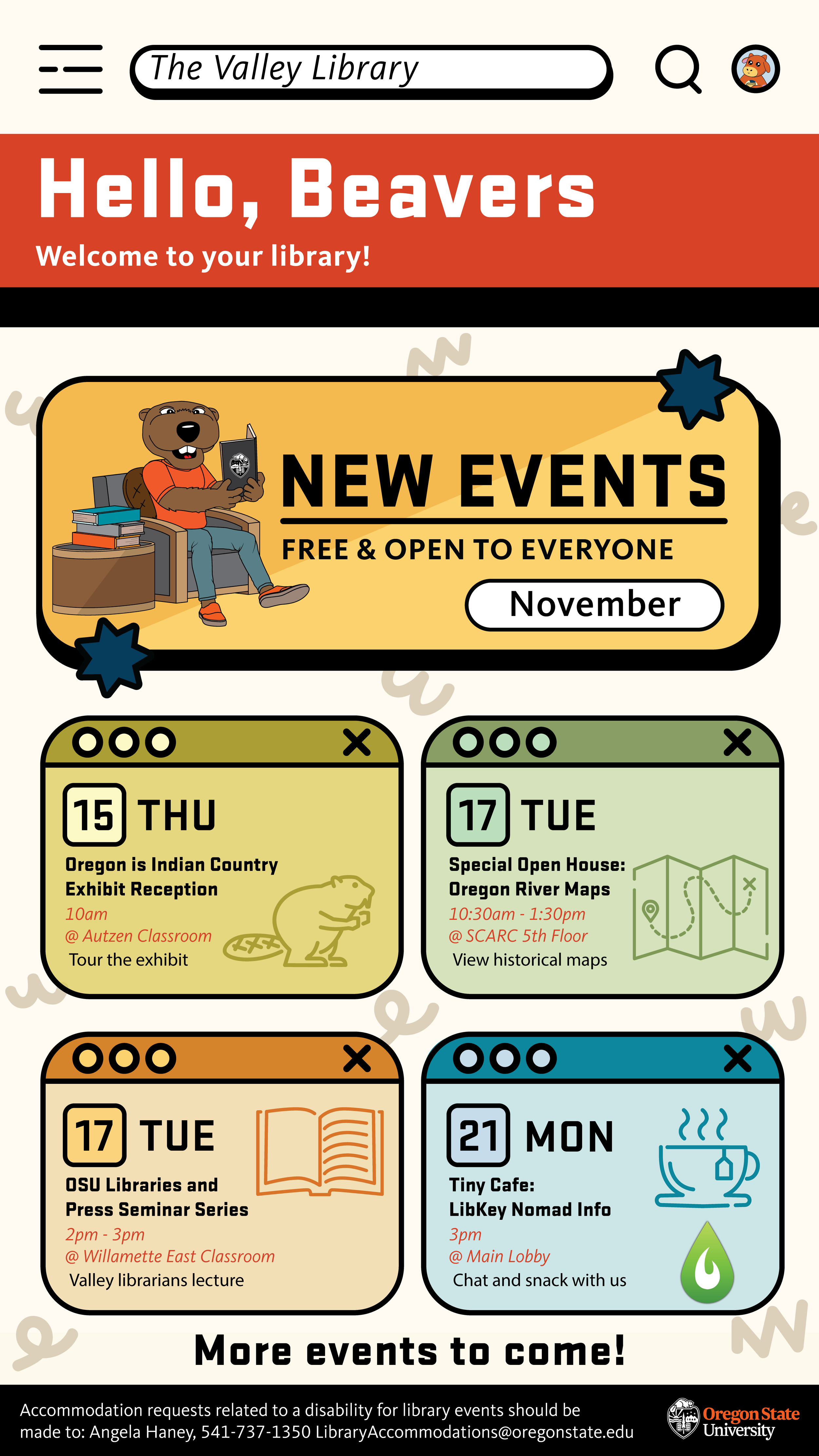
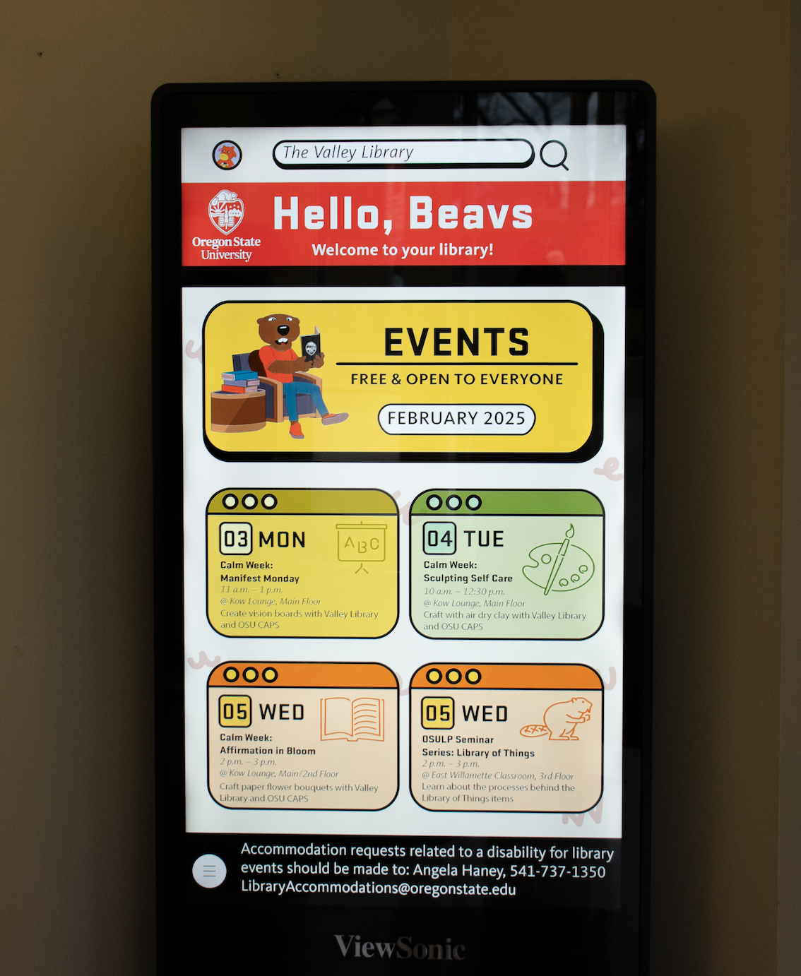
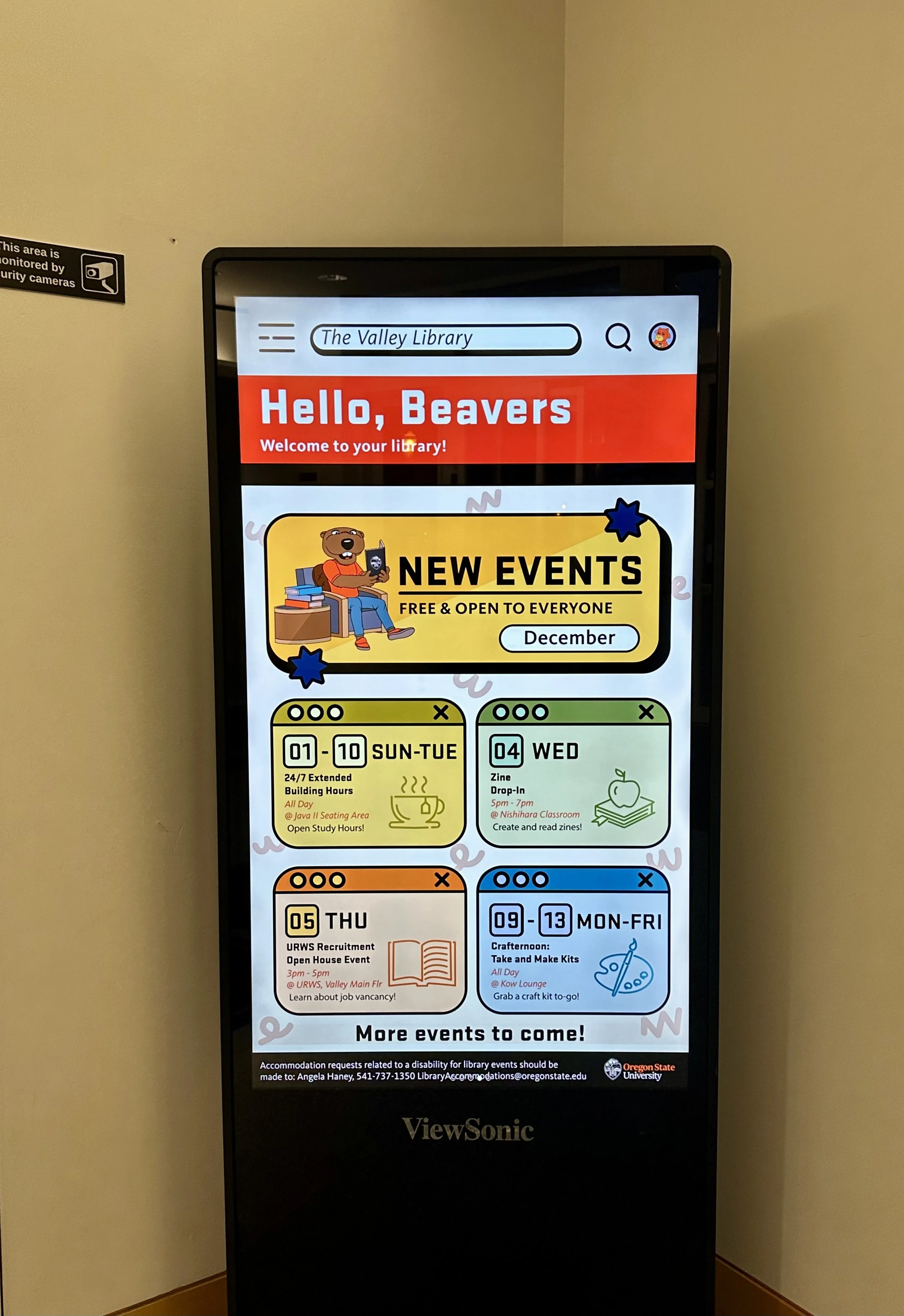
Mockups
Procreate
Tall Kiosk Template
Illustrator

Installation
Why This Works?
Modern and Vibrant Design
Uses pastel colors, modern shapes, and clean layouts to enhance clarity and appeal, making content visually engaging and easy to digest.
Engaging and Friendly Tone
Incorporates OSU mascot (beaver) with expressive visuals and bold headings, creating an approachable and inviting atmosphere that fosters emotional connection with the audience.
Improved Usability and Information Hierarchy
Organizes content with distinct panels and icons for each event, ensuring a visually intuitive structure that allows users to quickly find and engage with relevant information.
The template was designed in Illustrator with bright colors and a playful style to align with the preferences of the student audience (aged 18–25).
This template emphasizes engagement by using bold typography and cheerful visuals that reflect an approachable and dynamic tone.


Discovered
Vibrant visuals, clear hierarchy, and the use of illustrations and icons enhance engagement and make information easy to digest for younger audiences.
Learned
Design should balance creativity and functionality, with friendly mascots and interactive elements making posters more approachable and memorable.
Takeaway
Effective design aligns with user preferences, using visual tools to communicate information efficiently, ultimately enhancing communication and engagement for library events.